
Reorganization of client area navigation menu to improve user experience
Navigation menu
Users had difficulty finding important information for them, such as invoices, payment codes, and managing their products. A symptom of this problem was calls made to customer support, even when customers had access to the customer area (Minha Oi).
When asked why they weren't using "Minha Oi" they often mentioned "it was to difficult to find things in there."
Problem statement
Minha Oi
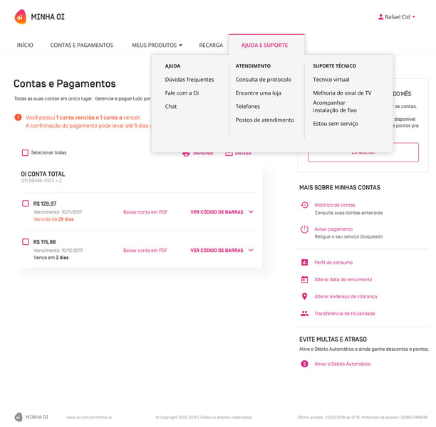
Minha Oi (client area) menu
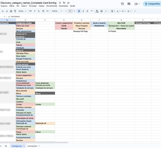
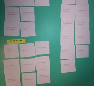
Content audit
First thing I wanted to know was what is the content inside Minha Oi. We knew that there were some legacy content, outdated pages and even some duplicates.
Running a content audit helped me to better visualize all of the content we had in Minha Oi and then plan an optimized content strategy for Minha Oi.
For this, I analyzed data of usage and aligned with stakeholders what could be removed and/or merged.
From 103 pieces of content, we ended up with a list of 23.
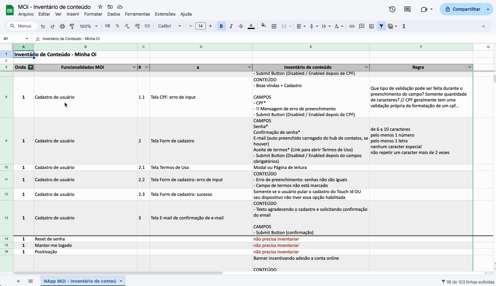
What's in "Minha Oi"?
Discovery
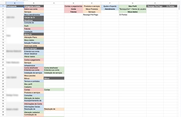
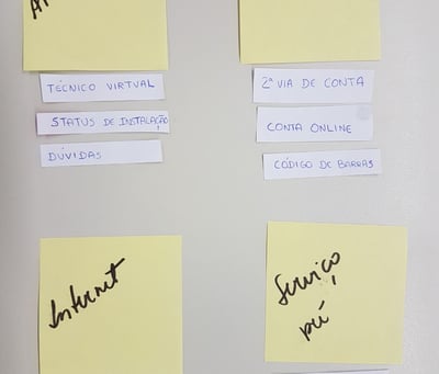
Card sorting
If organizing and labeling was up to customers, how would they do it?
So now that we had less pieces of content, we wanted to know how could we organize them in a way that makes sense to users.
Content audit - Minha Oi
Open card sorting sessions
Open card sorting
The opened card sorting sessions helped us to cross the pre-defined categories that we had at Minha Oi's menu, with labeling suggestions made by users.
With this, we identified some keywords that were often being mentioned by different users, that influenced the label of the groups.
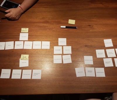
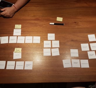
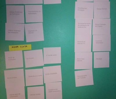

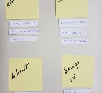
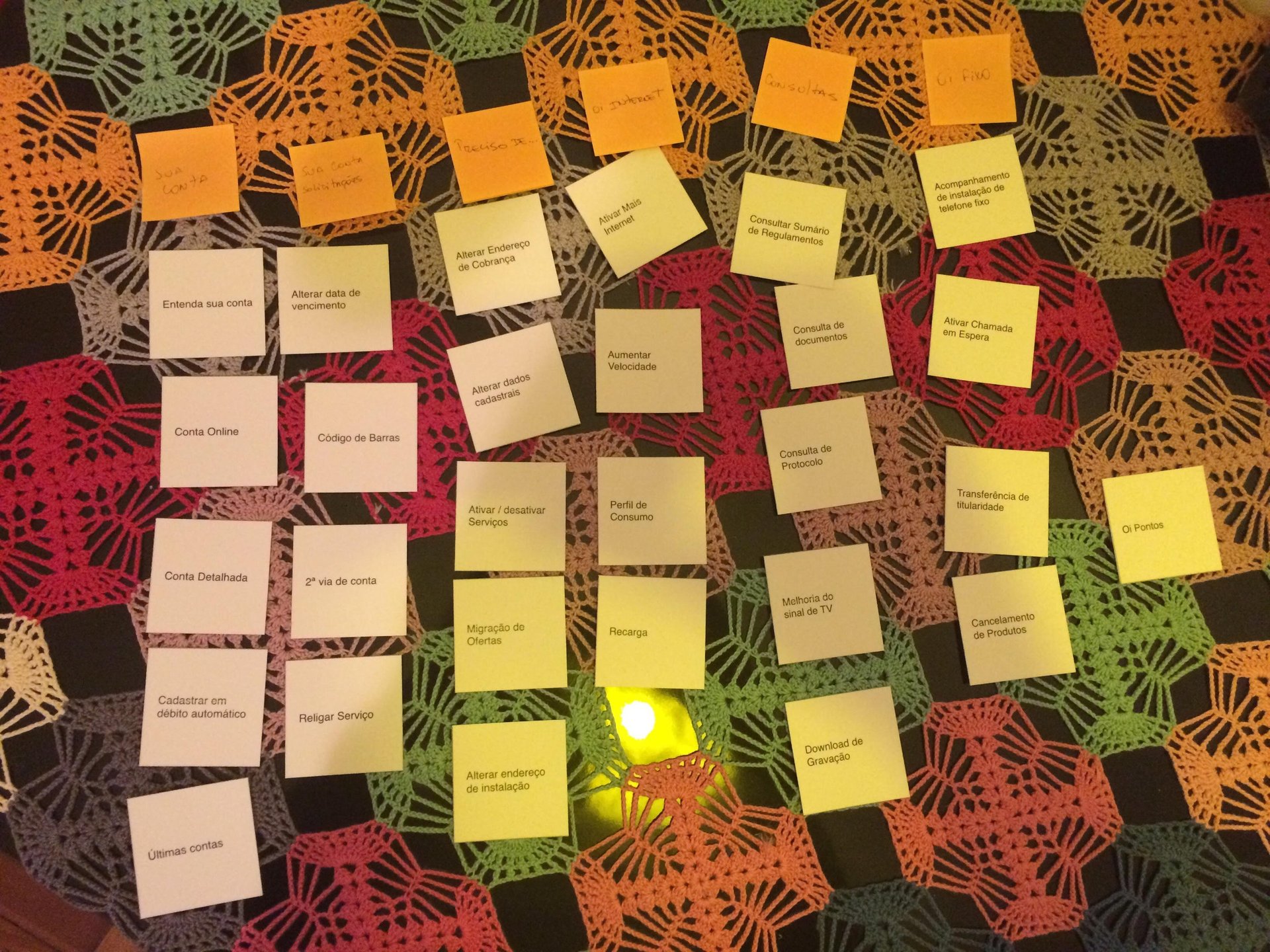
Crossing data
Small changes that helped us to fine tune comprehension to users
Initial menu categories:
Início (Home)
Conta (Billing)
Produtos (Products)
Recarga (Recharge)
Ajuda (Help)
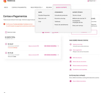
Categories created after open card sorting:
Início (Home)
Contas e pagamentos (Billing & Payments)
Meus Produtos (My Products)
Recarga (Recharge)
Ajuda e Suporte (Help & Support)
Tree testing
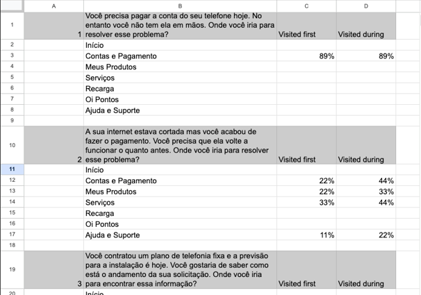
With the new label proposal for the categories, we wanted to validate if they would work. For this, we run a tree testing with 3 navigational tasks.
What they needed to do was use the pay menu to find the information the task asked them to find. Once it was found - or they thought they had found it - they had to flag it and complete it.
The tasks were related to the categories "Contas e Pagamentos"; "Meus Produtos" and "Ajuda e Suporte".
It was time to validate
Validation
Tree testing results
Success metrics
First click, task success rate (direct and indirect).
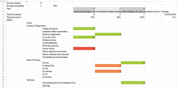
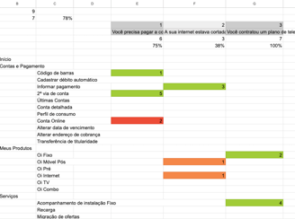
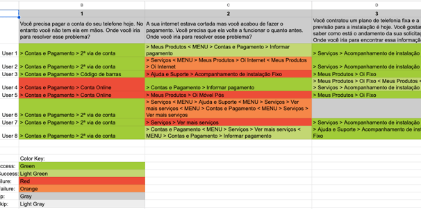
We achieved an overall task success rate of 71%
However we knew this number could be better as in 2 out of 3 tasks, the results didn't have a high confidence level. Participants diverged in a couple categories.
So as for next steps, we planned running a new session.
Results