Information architecture samples
Previous AI-related work I've done
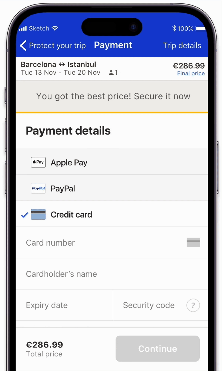
Payment screen revamp
We wanted to increase the conversion rate from the payment screen to confirmation screen
Business problem
eDreams
Hypothesis
We believe that the design of the payment form for credit card isn't very prominent so users can easily miss it when trying to add their credit card details.
Solution proposal
To revamp credit card form in the payment screen, making it more interactive and visual appealing to users.
Payment screen previous UI
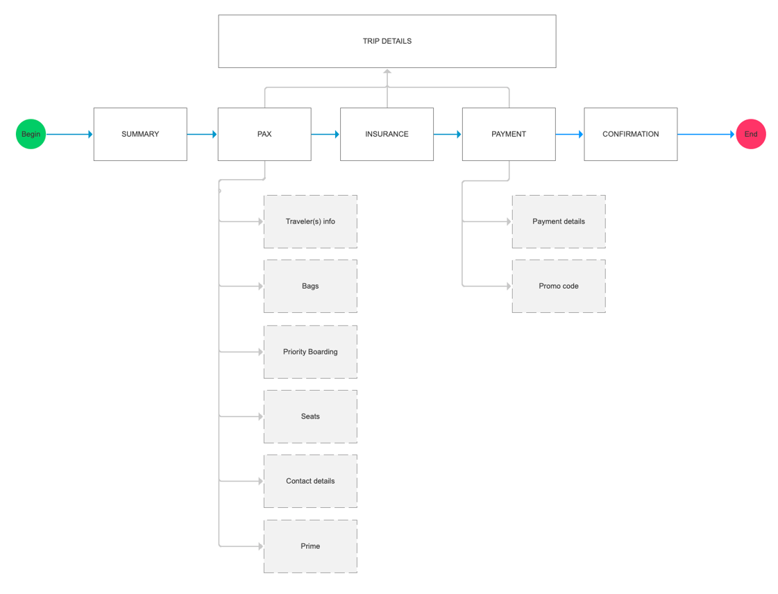
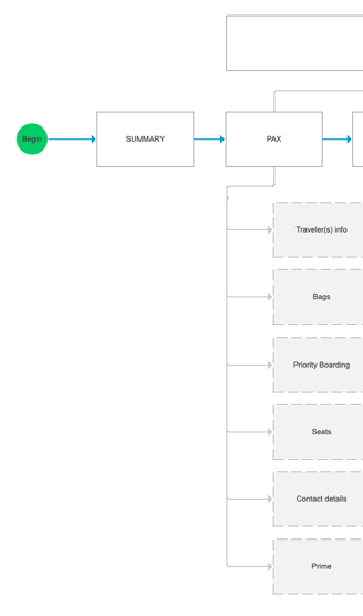
The following flow illustrates the path users had to go through in order to have their purchase confirmed.
PAX and Payment were the screens higher bounce rate. We chose to start with Payment screen as the tech effort implied to make the changes was lower.
User flow
I created a interactive prototype using Axure to test it with users. You can try it out.
Use the following data to have the form validated
Card number: 4401 4653 1123 4522
Expiry date: 08/22
CVV: 294
Wireframe Prototype
Scroll, click and try ⬆️
Ecommerce redesign
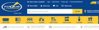
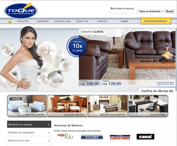
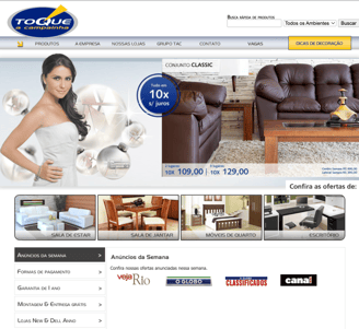
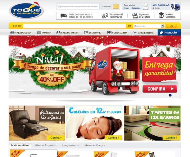
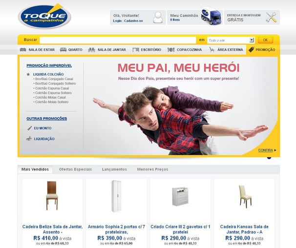
Toque a Campainha is a furniture retailer in Rio de Janeiro. They had a legacy e-commerce site that had the potential to perform much better than it did. Additionally, there were a lot of usability issues that were preventing users from having a good shopping experience.
Context
Toque a Campainha


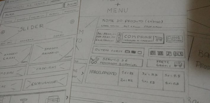
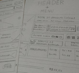
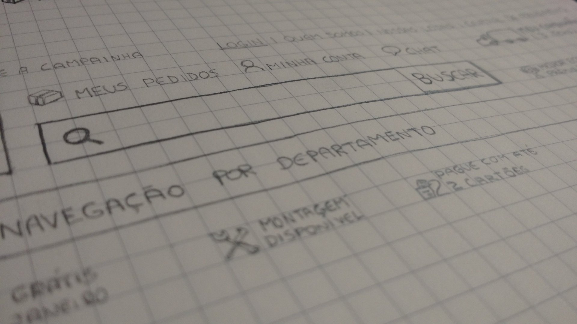
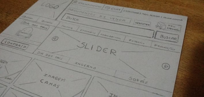
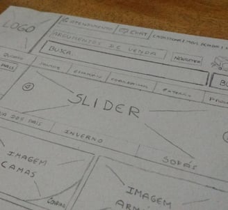
Wireframes used to plan the new website structure.
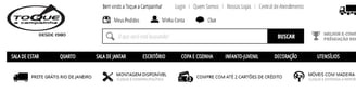
Information architecture techniques to redesign the menu
Toque a Campainha e-commerce menu had low prominence. It didn’t get many clicks compared to the other header elements. In addition, it required a high cognitive load because it was text-based.
In addition to this, finding products through the menu wasn't an easy task according to customers feedback.
Problem statement
Toque a Campainha


Card sorting
Tree testing